
Context
For Expel Managed Phishing, customer users submit suspicious looking emails to us and our security analysts determine whether or not the email is malicious or benign, whether or not there has been a security breach, and what to do to remediate the situation.
My Role
I was brought onto the phishing service proof of concept and tasked with creating a dashboard for customers to see the state of phishing submissions within their company.

Process
User Interviews
I normally work remotely, but in order to kickoff my involvement in the project, I flew to Expel headquarters in Herndon, VA, to conduct a number of informational interviews with the following users:
Security analysts - the users who would directly analyze phishing submissions to determine if an email is malicious or benign
Security analyst managers - to take a step back and understand what their goals were with the service
Engagement managers - these users work directly with customers to report metrics. They have a good idea of the kinds of information customers would be interested in.
Customers - I talked to the customers who were testing out our proof of concept

Competitive analysis - Metrics
Customers who would be interested in Expel Managed Phishing, are also likely to have other phishing applications. For example, phishing simulation software for training purposes. I looked at the publicly available documentation for these applications, as well as other products within the phishing space to see how they were serving metrics to their users in dashboards.
I created an inventory of all the metrics on these dashboards
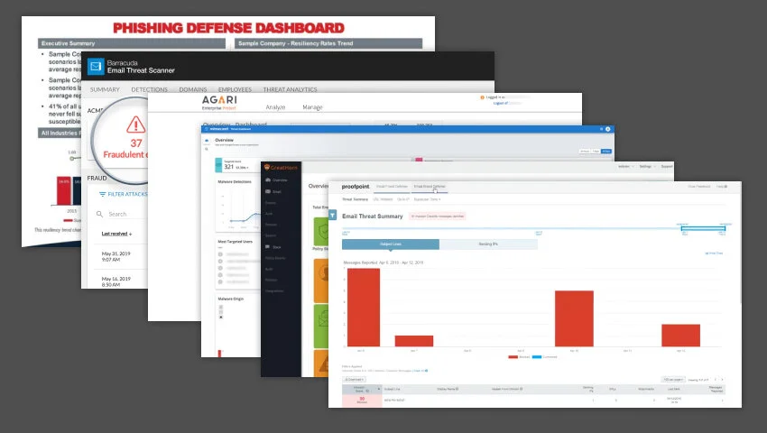
This is a sample of some of the products and dashboards I looked at.
Card sort
Once I had a long list of metrics that were out there in the phishing space, in addition to metrics mentioned by users, I did a few cardsorts to see the overarching categories that appeared across all of our competitors. I also mapped these categories to the goals I had for the dashboard.

Customer Card sort
For further clarity into desired metrics, using Optimal Sort I ran a remote, virtual card sort with one of our proof of concept customers and one of our engagement managers. This allowed them to create their own groupings of metrics and gave me insight to the ways that the metrics could be used.

Engineering and PM Check-in
Once I had a short list of metrics I knew would be useful to the customer, I checked in with the engineers and product manager to see which metrics we would be able to do immediately, and which metrics should be moved to a later version.

Picture of me in a conference call with engineering and product management
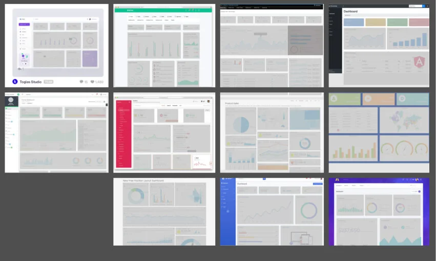
Dashboard Research
I also did a general dashboard search to see the kinds of layouts commonly used on dashboards, and to understand what kind of visualizations generally tend to be prioritized.
For other Expel dashboards, we pull from chartjs library, so when I started designing, I made sure that any visualization I chose would be supported.
Brainstorming
For almost every metric grouping, I sketched and mocked up every possible way to visualize the data that would make sense. This allowed me to not only see which visualization fit which metric, but essentially gave me a visualization library to pull from when creating mockups for the dashboard as a whole.

I started off working in black and white to not be distracted by choosing a color palette
User Testing
Once I was able to nail down a first iteration of the dashboard, I presented it to a proof of concept customer, as well as some of our customers who were interested in a phishing service. Feedback was largely positive, and I did get constructive comments to make tweaks before creating the final version.
“This will make it easier to report up.”
“All of the information here is useful in some way.”
Developer Collaboration
The design for the dashboard was complete in June 2020, and I presented it to our cross functional team.
However, there are always questions and edge cases that come up after the main design phase that require collaborative problem solving. For example, if you have a timeframe for “the past 30 days,” how many days are you actually counting? If you say “the past 30 days” but it’s really 31 days because you’re including today, is it dishonest to say “the past 30 days”? ¯\_(ツ)_/¯

Design & Outcomes
The phishing dashboard was released in August of 2020 and we got great feedback from customers. It eventually became a selling point for the sales team, which leads us to…
Product-Led Growth experiment
In late 2020, I was asked to design a cross-selling experiment as part of our product-led growth initiatives - basically, unobtrusively sell the phishing service to existing customers within the product. Because many potential customers have an ‘aha!’ moment when seeing the dashboard, this experiment was designed around around the dashboard experience and metrics.
The experiment was a success. Development and design was meant to be lightweight, and led to a ~5% conversion rate within the first month. The experiment continues to pique customer interest even now (September 2021) with little maintenance and upkeep required from the team.
